
So, the other day I responded to a tweet by Felix Schönbrodt. He called out a tweet by GESIS – Leibniz-Institut für Sozialwissenschaften that showed data on life satisfaction in Germany from 2010 to 2016 without a y-axis (below left). He added a picture of a tweet (below right) that suggests it is dishonest to truncate your y-axis and I completely disagree with the message of this tweet! Importantly, I do agree with Felix that the GESIS graph was a prime example of how not to visualize data. Still, I want to use this post to point to some considerations, when choosing the range of your y-axis.
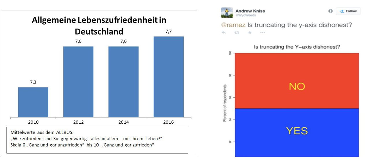
Left: graph posted by GESIS – Leibniz-Institut für Sozialwissenschaften on twitter. Right: picture of tweet posted by Felix Schönbrodt on twitter.
First of all let’s make the case for including “0” in bar graphs (a more detailed account can be found here) and then move on to situations where it is dishonest not to exclude it. I believe Felix’ main point is that in a bar graph the height of the graph represents something meaningful about the data. One case, where this is in-arguably true, is for height, e.g., below, I have graphed body heights of my family. In the left panel, I have included “0” and you can roughly judge that I am twice as tall as my daughter Sophie. If the y-axis is truncated, as in the middle right panel, this same interpretation would make me ten times taller than Sophie and in fact, in that graph, Liah is infinitely smaller than me. Nonsense.
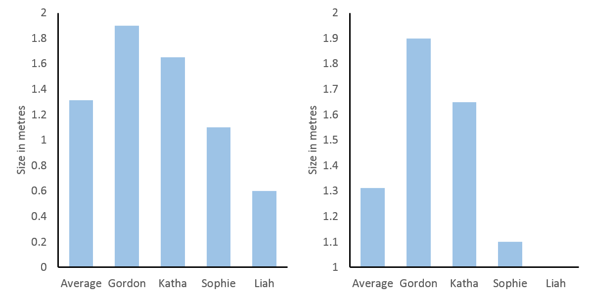
Left: heights of the Feld family with y-axis starting at 0. Right: heights of the Feld family with y-axis starting at 1.
Of course, this was an over-exaggeration to make a point. However, since people have the expectation that the height of a bar graph is relevant to its interpretation, it will distort how people interpret more relevant and realistic data, if this is not true. And this expectation is only true, if the data have a meaningful “0”, which is directly connected to the scale of measure. In statistics a scale that has a true “0” is called an absolute scale and it shares the feature of our above left bar graph that ratios can be interpreted, i.e., we can say the value 4 is twice as large as 2 (just as we said I am twice as large as Sophie).
To contrast this, let’s move to some other data, the forecast for temperature in degree Celsius in St. Albans/UK on 7th April (see below top left and know that I am not very happy about this forecast). 0°C may seem like a true “0”, since it is the temperature at which water freezes. Thus, when comparing 7h and 11h (in red) you might be tempted to say that the temperature has doubled from 7°C to 14°C in four hours. However, a quick look at the same data transformed to degree Fahrenheit (below lower left) reveals this to be untrue (57.2°F at 11h is not twice as high as 44.6°F at 7h). The reason for this is that these scales are interval scales, which means that only the ratio of their differences can be compared. For example, the difference in temperature between 13h and 7h is eight times the difference in temperature between 13h and 11h, regardless of measuring in °C or °F (below right).
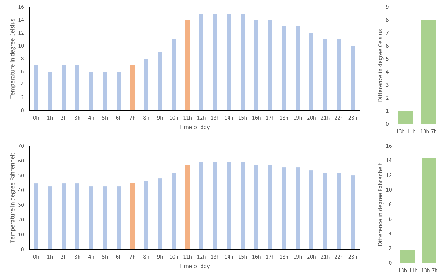
Temperature forecast for St. Albans on 7th April 2018. Top left: in degrees Celsius. Bottom left: in degrees Fahrenheit. Top right: difference in temperature in degree Celsius between 13h and 11h as well as 13h and 7h. Bottom right: difference in temperature in degree Fahrenheit between 13h and 11h as well as 13h and 7h.
We can get around the shortcoming of interval scales in this case, as temperature can be expressed in degree Kelvin, which has a true “0” (nothing can be colder than absolute zero). However, if you look at the graph for °K (below) you see that this is not very helpful. While we could now validly interpret the ratio of temperatures, including absolute zero has scaled the graph so that the small differences of interest to me are no longer discernible. This is probably why we still hang on to our outdated use of °C or °F, as they nicely scale with the range relevant to our daily lives.
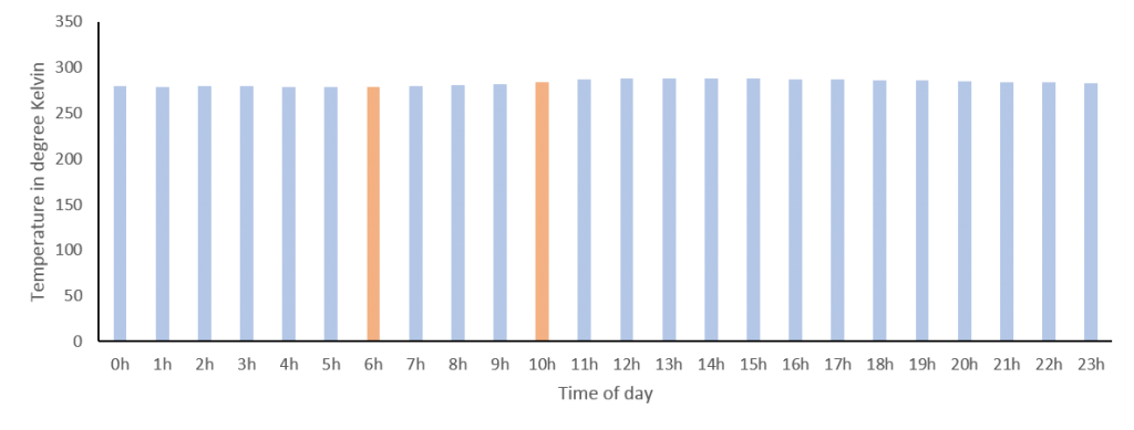
Temperature forecast for St. Albans on 7th April 2018 in degrees Kelvin.
Note, if a scale does not have a true “0” or if it would make the interesting differences indiscernible, we should not use bar graphs, to convey that ratios of values cannot be interpreted. An alternative simple way to visualize data that does not imply this, is the line graph, which works nicely for time series data like our temperatures. However, excluding “0” – as it is not informative – introduces bias, since we need to decide which arbitrary range the y-axis should cover. This can make a huge visual difference! For our temperature data a simple approach could be for the y-axis to start at the minimum and end at the maximum values measured for that day (below top) or you could use the minimum and maximum temperatures measured on earth in general (below middle). However, you might agree that the first exaggerates the differences across the day and the other marginalizes them, so like me you might prefer to use the average minimum and maximum temperatures in St. Albans measured over the year (below bottom). Importantly, your choice will depend on what you want to convey and the expectations of your audience. In other words you should use a meaningful range.
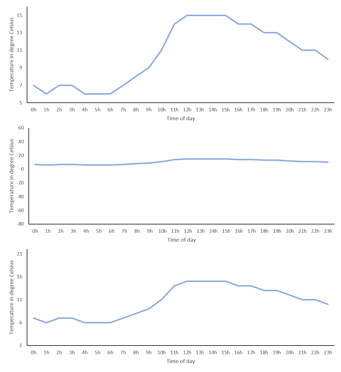
Temperature forecast for St. Albans on 7th April 2018 in degrees Celsius. Top: y-axis range 5° to 16°. Middle: y-axis range -80°to 60°. Bottom: -axis range 1°to 22°.
The definition of what is meaningful sometimes seems a bit arbitrary and, if you have read How to Lie with Statistics by Darrel Huff, you may think the goal of any data visualization is to deceive instead of conveying meaning. And for sure, as we have seen, choosing the range of your y-axis you can make very small differences look huge or very large differences look irrelevant. However, it is dangerous to suggest that there are no guidelines how to visualize data and anything is up to interpretation. In the next paragraph, I will try to make the point of using the variance of the data as a meaningful tool to fix your y-axis range.
Below, I have simulated some IQ-values (mean = 100, SD = 15) in three different groups (let’s say orange-, purple- and red eyed-people) and made three graphs with different y-axis ranges. On the left, it looks like having orange eyes is related to a much lower IQ than having red eyes, whereas in the middle the differences looks negligible and this is – as we know – only because I have chosen the y-axis to make this impression. Luckily, in science, a relatively unbiased way to choose the scale of your y-axis, is to include the variance of your variable. On the right, I have added the standard deviation of each group as error bars and changed the range of the y-axis to roughly the mean plus minus twice the standard deviation. Now differences no longer need to be interpreted in relation to the y-axis range, but can be related to the variance of the variable. The gold standard, of course, is to define the range of your y-axis with respect to the variance expected from the literature, as this is not biased by the level of noise in your measurements. Importantly, if the error bars in a graph look very large or very small, this may indicate that somebody is trying to deceive and make you believe differences are smaller or larger than they really are. If it is your graph, you may be deceiving yourself.
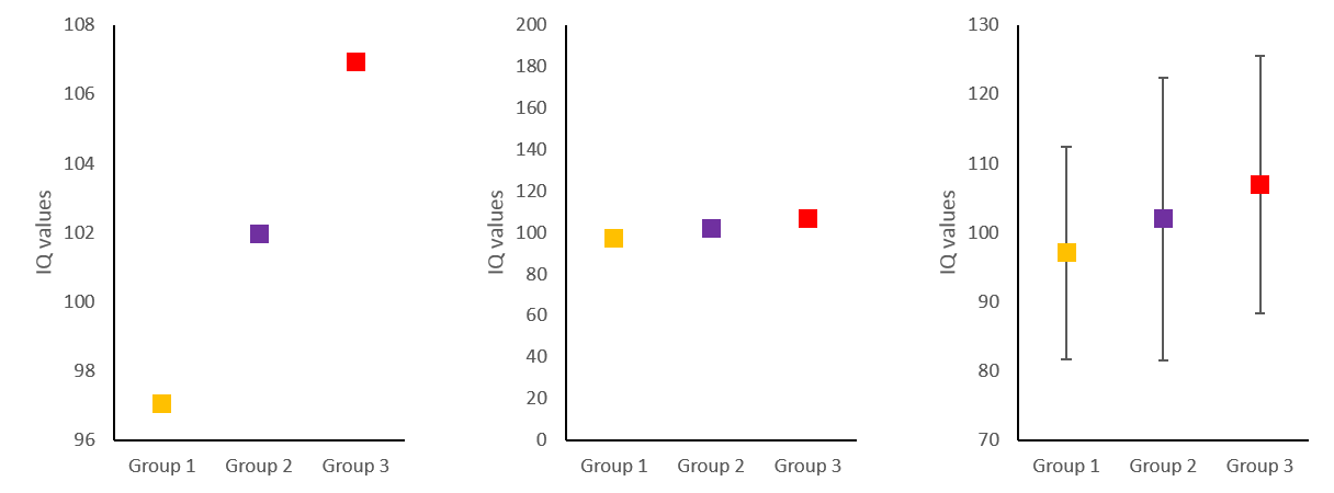
Simulated IQ-data in three groups (mean = 100, SD = 15). Left: y-axis range 96 to 108. Middle: y-axis range 0 to 200. Bottom: y-axis range 70 to 130.
In conclusion, I believe, it is not dishonest, if your y-axis does not include “0”. However, it is very important that the range of your y-axis covers a meaningful interval, which is often defined by the sample variance of your variable or by a priori consideration of typical variance in that variable. Coming back to the GESIS graph, it is clear that its y-axis does not cover a meaningful range, as it overemphasized changes of only 0.4 on a 10 point Likert scale and does not provide error bars.

