If one thing has changed my view of stats in the last couple of years, it has been using simulation to explore how they pan out for 10.000 studies.
Using simulation is an approach that Daniël Lakens uses a lot in his free online course on stats. If you haven’t had a look at it yet, I highly recommend you do! This approach makes sense, especially for the NHST approach, since, as Daniel puts it, the α-level mainly prevents you from being wrong too often in the long run. Simulations help you get an intuition what that means. Recently, we prepared a preprint that describes how equivalence tests can be used for fMRI research and while I was preparing Figure 1 for that, I had some insights about effect sizes and the uncertainty of point estimates that seemed worth a blog post.
My background is in biological psychology and cognitive neuroscience, a field that suffers from studies that have small samples and are likely underpowered. Excuses for not changing these habits that I have heard frequently are “effect sizes are large in our field” and “small effects don’t matter”. The former will be the subject of the current post, but hopefully I will also get to write about the latter. Connoisseurs of the replication crisis literature will of course know that, e.g., the effect sizes in fMRI research are inflated by small sample sizes (e.g., Button et al. 2013). This makes sense as the sample size determines the critical effect size that is needed to reach statistical significance. This problem is ameliorated when one reports confidence intervals around the point estimates of effect sizes. Today I want to give an intuition how point estimates of empirical effect sizes behave at different sample sizes, when there is no underlying effect. This gave me a better understanding of what the confidence interval means. Of course, all this will be completely clear to the more mathematically minded without using simulations. However, if you are like me, a visualization will make it much easier to understand.
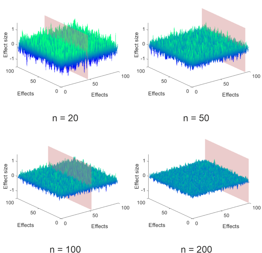
The simulations I performed are very simple. I created a 100 x 100 matrix of simulated experiments (effects) for a control group and an experimental group by picking normally distributed random numbers with a mean of 0 and a standard deviation of 1. I arbitrarily picked the population to be 1000 per group and then randomly selected subsamples to look at the effect of different sample sizes. For each of the 100 x 100 experiments I calculated the effect size (Hedge’s g), which can be seen below, using the MES toolbox by Hentschke and Stüttgen (an awesome resource, if you are using Matlab like me). As you can see at small sample sizes the surface is very rough – a storm on the sea of uncertainty – and gets more and more even as the sample size increases.
Figure 1: Sea of uncertainty, i.e., effect size estimates from 100 x 100 simulated group comparisons
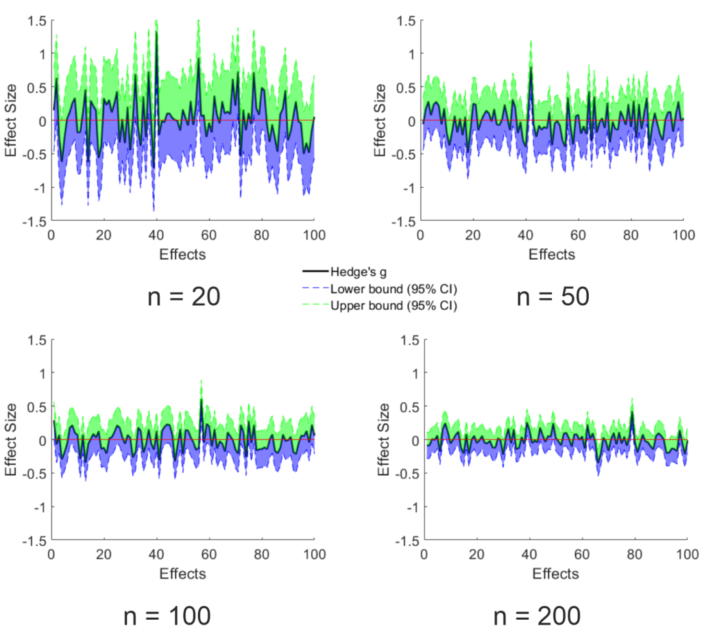
This influence of sample size makes sense since the uncertainty of the point estimate is reduced the larger the sample gets, as can be seen below. For these graphs, I took the data that lies on the plain shown in the above figure (this was set to appear at the largest effect size estimate) and added the 95% CI of the point estimate calculated using the toolbox mentioned above. Trivially, the width of the CI is reduced by increasing sample size. Importantly, since the ground truth is known (I only simulated null effects), the amount of expected false positives remains the same (5%). Since the uncertainty is reduced by sample size, the effect size of the false positives is on average lower the larger the sample is. Something that makes sense, but which I did not expect. I think, this strongly contradicts the “effect sizes are large in our field” argument.
Figure 3: Effect size estimates and 95% CI on the plane shown in Figure 1
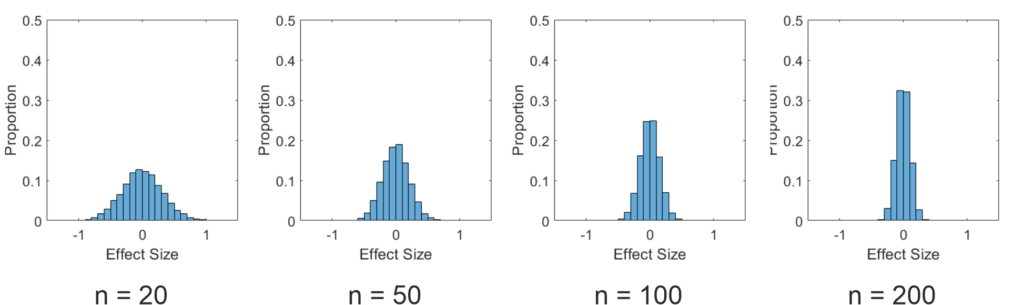
To emphasize this, I also plotted histograms of the effect sizes in this simulation below. As you can see, the effect sizes nicely follow a normal distribution. However, the distribution is much wider for small samples than for large samples. This has to be the case, as on average 5% of the estimated effects must be above (or below for two sided tests) the critical effect size to produce the expected false positives.
Figure 3: Histogramms of the effect size estimates
As I said above, all of this follows from the math used for NHST, but for me it was a revelation to see the simulations. Of course, so far I have only showed the case, where the null hypothesis is true. I would say nobody thinks we live in a world, where this is always the case. In the next post, I want to look at what happens, when I also simulate true effects. So stay tuned.
Recently, I started thinking about the chances of finding that one process is involved in two separate functions. If it affects these functions completely independently and they also do not affect each other, it seems intuitive that finding both functions in one experiment is harder than each of them individually. I put this intuition to test in some simple data simulation. (Of course, if you are more maths savvy than me, you can just come up with some equations to solve this. If this is you, please excuse my inferiority and stop reading here.)
A photograph of an engraving in The Writings of Charles Dickens volume 20, A Tale of Two Cities, titled “The Sea rises”. (public domain)
Before I
start, I want to give you an example of what I mean. In sleep research, a
scientist might want to know something about whether a specific sleep stage (or
other specified sleep process) influences only declarative, only procedural
memory, both or neither. To find out, one might set up an experiment, where one
runs two independent tasks that recruit these two memory systems, respectively.
One would then manipulate whether the participants stay awake or nap for 60
minutes (such a nap usually only contains slow wave sleep). Assuming that both
memory systems benefit equally from slow wave sleep, but are otherwise
completely independent, how big are your chances of finding this in these data?
Of course, this depends also partially on your statistical approach. In my experience, many researchers would run their statistics separately on task A and B, as they are assumed to be independent. It would be possible to plug both tasks into a multivariate analysis, but most of the time the research I have seen so far is satisfied to use two univariate analyses. Then the paper would say something along the lines of “task A was significantly affected by our manipulation, whereas task B was not”. Therefore, for sake of argument I will also choose this approach, even though I know that absence of evidence is not evidence of absence.
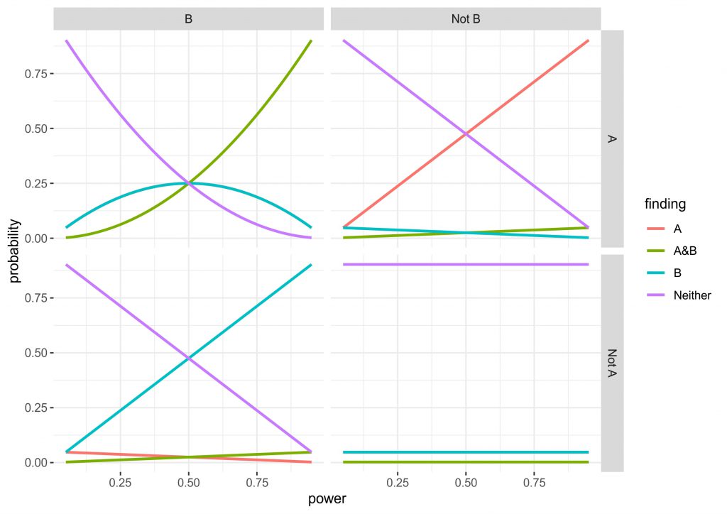
Concretely in my data simulation (and simulation is clearly overstating what I did, it is really just some simple multiplications) I consider all four possibilities of ground truth (the manipulation is effective for: 1. A and B, 2. only A, 3. only B, 4. Neither). In an experiment, this design can lead to the four corresponding findings (the manipulation is effective for: 1. A and B, 2. only A, 3. only B, 4. Neither), but depending on truth condition a proportion of these will be false or true, all depending on the power and alpha-level set in the experiment. I chose to use the standard alpha-level of 0.05, since this is quite widely accepted. For power, I used the range from 0.05 to 0.95 to see how it affected the results and set both tasks to always have equivalent power. You can see the data in the figure below.
Figure 2: Two by two graph of the four possible ground truths in an experiment with two taks. Top left: both A and B are affected by the manipulation. Top right: only A is affected by the manipulation. Bottom left: only B is affected by the manipulation. Bottom right: Neither is affected by the manipulation. Lines show the probability of true positives and false positives for each scenario as a function of power. Note in the top left and bottom right only A and only B are overlapping.
Three of the four the panels are completely intuitive, but I will give you a quick run through anyway. The bottom right shows the values when the ground truth is that neither A nor B is affected by the manipulation. Obviously, irrespective of the power we correctly reject an effect for both outcomes ~90% of times, whereas for both outcomes individually there is a roughly 5% chance of a false positive (the lines are completely overlapping). Finding that A and B are affected is very unlikely, as you would have to get two false positives simultaneously (0.05 x 0.05). The top right and bottom left are identical, just that either A or B being affected are true. What can be seen here is that the intuitive approach to use independent statistics actually works quite well, the higher the power the higher the chance of getting a hit, but incorrectly finding that B is affected or that both A and B are affected is relatively uncommon.
The top left panel for me is the most interesting. Here, the truth condition is that both A and B are affected by the manipulation. However, at low power there is actually a higher chance that you will find that only A or only B are affected. Also, don’t be fooled by the A&B line being higher after a power of 0.5, since the only A and only B lines are overlapping, it actually takes until a power of ~0.7 until chances are higher to find A and B than either of these. In fact, at a power of 0.5 you have a chance of finding either A or B half of the time, while there is only a chance of 0.25 of finding A and B. Although this is all only simple multiplication and it is intuitive that finding two effects is harder than finding one, the magnitude of the problem was not clear to me. (Importantly, the maths depend on the tasks being independent, as soon as dependence comes in, the results may be very different. In addition, you may find that different tasks have different amounts of noise or the effects are of different size, so power could also be different.)
What does
this mean for the research example above? In sleep research, we are often
dealing with samples that are on the small side, so we might be running quite
low powered studies. This means that when we find that slow wave sleep only
affects a declarative task, but not a procedural task, there is the possibility
that this is due to the considerations laid out here rather than distinct
memory processing. Possibly, one partial solution would be to run multivariate
tests or to run a superiority or equivalence test on the data and I might do
some simulations on that in future. However, I do think that these data suggest
another big problem with running underpowered research. Especially, in research
areas, where replication is hardly ever performed and thus such errors can
remain undetected.
Let me know, what you think about this. Also happy about resources, if this has been delt with before (likely with more depth). Here is the R code, so you can go and play around, if you want. Full disclosure: I am new to R so I coded this up in Matlab first and then repeated it in R…you can imagine which took longer.
#Here we set up the range of power values we use
power_values <- seq(from = 0.05,to = 0.95, by = 0.01)
#This is our alpha that can be varied, if you want to see what happens
alpha_is <- 0.05
#This sets up an array of NaNs to populate later
outcome_probs <- array(rep(NaN, 4*4*length(power_values)), dim=c(4, 4, length(power_values)))


#This runs a loop for each power value
for (k in 1:length(power_values)) {
     #the kth power value is used
     power_is <- power_values[k]
     #temporary power and alpha are loaded into these vectors
     probsA <- c(power_is, power_is, alpha_is, alpha_is)
     probsB <- c(power_is, alpha_is, power_is, alpha_is)

     #this runs a loop for the 4 different truth conditions
     for (i in 1:4) {
       probA = probsA[i]
       probB = probsB[i]

       #saves the data in the array
       outcome_probs[,i,k] = c(probA*probB, probA*(1-probB), (1-probA)*probB, (1-probA)*(1-probB))
     }

}


#creates a temporary vector to reshape the data
 temp_outcome_probs = matrix(outcome_probs,nrow = 16*length(power_values), byrow = TRUE)
 #turns the data into a data.frame
 outcome_probs_long_df <- data.frame(temp_outcome_probs)
 #adds the column name "probability"
 colnames(outcome_probs_long_df) <- c("probability")

 #adds the variable power values to the data.frame
 outcome_probs_long_df$power <- rep(power_values,each=16)
 #adds the variable finding with the 4 finding conditions
 outcome_probs_long_df$finding <- rep(c("A&B", "A", "B", "Neither"), times = length(power_values)*4)
 #adds the variable truthA with the two truth conditions for A
 outcome_probs_long_df$truthA <- rep(c("A", "Not A"), times = length(power_values), each = 8)
 #adds the variable truthB with the two truth conditions for B
 outcome_probs_long_df$truthB <- rep(c("B", "Not B"), times = length(power_values)*2, each = 4)

 outcome_probs_long_df$truthB

 #loads ggplot
 library("ggplot2")

 #makes a graph with the four truth conditions and lines for each of the four findings
 plot_outcome_probs <- ggplot(outcome_probs_long_df, aes(x=power, y = probability)) +
   geom_line(aes(colour = finding , group = finding), size=1) +
   facet_grid(truthA ~truthB)

 plot_outcome_probs + theme_bw()
Update 1: In a few days the first two PhD-students of my group will be starting. One of them Juli Tkotz has come up with two improved versions of my above code, which I am allowed to share here:
library(tidyverse)

# Function for calculating outcome probability
calculate_finding_prob <- function(finding, probA, probB) {
  prob <- rep(NA, length(finding))
  prob[finding == "AB"] <- probA[finding == "AB"] * probB[finding == "AB"]
  prob[finding == "A"] <- probA[finding == "A"] * (1 - probB[finding == "A"])
  prob[finding == "B"] <- (1 - probA[finding == "B"]) * probB[finding == "B"]
  prob[finding == "neither"] <-
    (1 - probA[finding == "neither"]) * (1 - probB[finding == "neither"])

  return(prob)
}

# Range of power values
power_values <- seq(.05, .95, .01)
# Alpha levels to be examined
alpha <- c(.05, .1)
# Possible "truths" and corresponding probA and probB values
truth_probs <- data.frame(truth = c("AB", "A", "B", "neither"),
                          probA = c("power", "power", "alpha", "alpha"),
                          probB = c("power", "alpha", "power", "alpha"),
                          stringsAsFactors = FALSE)
# Possible findings
findings <- c("AB", "A", "B", "neither")

# Combination of each power value, each alpha level, each truth and each finding
combinations <-
  expand.grid(power = power_values, alpha = alpha, truth = truth_probs$truth,
              finding = findings, stringsAsFactors = FALSE)

# Insert probabilities
# When present: power; else: alpha
combinations$probA <-
  ifelse(truth_probs$probA[match(combinations$truth, truth_probs$truth)] == "power",
         combinations$power, combinations$alpha)

combinations$probB <-
  ifelse(truth_probs$probB[match(combinations$truth, truth_probs$truth)] == "power",
         combinations$power, combinations$alpha)

# Calculate probabilities - formula varies as a function of finding
combinations$probability <-
  calculate_finding_prob(combinations$finding, combinations$probA,
                         combinations$probB)

# For alpha = .05
combinations %>%
  filter(alpha == .05) %>%
  ggplot(aes(x = power, y = probability)) +
  geom_line(aes(colour = finding, group = finding), size = 1) +
  facet_wrap(~ truth, nrow = 2) +
  theme(legend.position = "top")

# For alpha = .1
combinations %>%
  filter(alpha == .1) %>%
  ggplot(aes(x = power, y = probability)) +
  geom_line(aes(colour = finding, group = finding), size = 1) +
  facet_wrap(~ truth, nrow = 2) +
  theme(legend.position = "top")
library(tidyverse)

power_values <- seq(.05, .95, .01) # Range of power values
alpha <- c(.05, .1) # Alpha levels
variables <- c("A", "B", "C")

# GENERATE FINDINGS
# For each variable, we can either find the given variable or nothing ("")
findings <- lapply(variables, function(x) c(x, ""))
# All possible combinations
findings <- expand.grid(findings, stringsAsFactors = FALSE)
# Paste together
findings <- apply(findings, 1, function(x) paste0(x, collapse = ""))
# "" should be "neither"
findings <- ifelse(findings == "", "neither", findings)

# All possible combinations of variables being truly observed or not
var_combs <- rep(list(c(TRUE, FALSE)), length(variables))
names(var_combs) <- variables
var_combs <- expand.grid(var_combs)

# All possible combinations of power, alpha levels and possible findings.
to_add <- expand.grid(power = power_values, alpha = alpha, finding = findings)

# Each "truth combination" has to be combined with every power/alpha/finding
# combination. So, we repeat each row in to_add (power/alpha/finding combination
# for every combination (row) in combinations and the other way round. And then
# merge the whole thing.
# ATTENTION! First, we use "each", then, we use "times"!
# (TO DO: There has to be a more elegant vectorised way of doing this)
comb1 <- to_add[rep(seq_len(nrow(to_add)), each = nrow(var_combs)), ]
comb2 <- var_combs[rep(seq_len(nrow(var_combs)), times = nrow(to_add)), ]
combinations <- cbind(comb1, comb2)

# Truth column: What would have been the true finding.
# We use the rows of the columns that contain variable status as index to
# extract the variables whose effects are truly present.
combinations$truth <-
  apply(combinations[variables], 1,
        function(x) paste0(variables[x], collapse = ""))
combinations$truth <-
  ifelse(combinations$truth == "", "neither", combinations$truth)

# Now, each row is uniquely identifiable by a combination of power, alpha,
# finding and truth, so we can safely gather variables into long format.
# Gather will take the column names to gather from the object variables in the
# environment.
combinations_lf <- combinations %>%
  gather(variable, effect_present, variables)

# Proof: Two variables per combination of power, alpha, finding, truth
combinations_lf %>%
  group_by(power, alpha, finding, truth) %>%
  count()

# We create another column if the effect of a given variable has sucessfully
# been detected, i.e. if the given variable is present in the column finding.
combinations_lf$effect_observed <-
  sapply(seq_along(combinations_lf$variable),
         function(x) grepl(combinations_lf$variable[x], combinations_lf$finding[x]))

# Now, we calculate the probability of effect_observed based on the following
# logic:
# If an effect is     present and     observed -> power
# If an effect is     present but not observed -> 1 - power
# If an effect is not present but     observed -> alpha
# If an effect is not present and not observed -> 1 - alpha

# In other words:
# present:  TRUE = power; FALSE = alpha
# observed: TRUE = x;     FALSE = 1 - x

combinations_lf <-
  combinations_lf %>%
  mutate(var_probability = ifelse(effect_present,
                                  power, alpha))

combinations_lf <-
  combinations_lf %>%
  mutate(var_probability = ifelse(effect_observed,
                                  var_probability, 1 - var_probability))

# We calculate the probability of a given finding by multiplying all the
# probabilities of effect_observed for a combination of power, alpha, finding
# and truth.
combinations_lf <- combinations_lf %>%
  group_by(power, alpha, finding, truth) %>%
  mutate(finding_probability = prod(var_probability))

# Plot for alpha = .05
combinations_lf %>%
  filter(alpha == .05) %>%
  ggplot(aes(x = power, y = finding_probability, colour = finding)) +
  geom_line(size = 1) +
  labs(y = "probability") +
  facet_wrap(~truth) +
  theme(legend.position = "top")

# Plot for alpha = .1
combinations_lf %>%
  filter(alpha == .1) %>%
  ggplot(aes(x = power, y = finding_probability, colour = finding)) +
  geom_line(size = 1) +
  labs(y = "probability") +
  facet_wrap(~truth) +
  theme(legend.position = "top")
If your stats class was anything like mine, you learned that using ANOVA instead of t-tests is a sneaky way to avoid the multiple testing problem. I still believed this until very recently and a lot of my colleagues are bewildered, when I try to convince them otherwise. Of course this has been covered quite a bit. For example, there is an awesome blog-post by Dorothy Bishop and there is this great recent paper . In addition to that, today, I want to share a simple way to convince yourself this truly is a problem using some simulated data and SPSS.
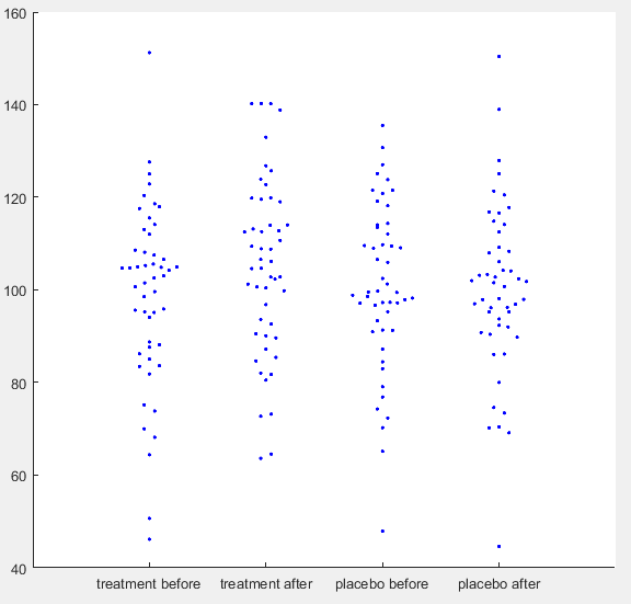
Simulated IQ-data. First a ground truth was simulated with mean = 100 and SD = 15 for 50 participants. For each condition normally distributed noise was added with mean = 0 and SD = 8. For ‘treatment after’ additionally a normally distributed effect was added with mean = 5 and SD = 10. (See MATLAB code for details)
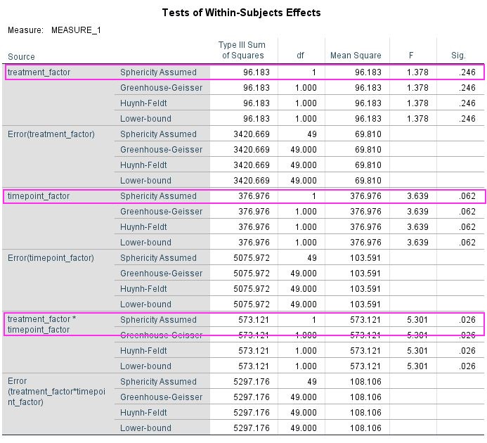
Let’s say you have run a simple experiment on intelligence, where you wanted to find out, if a drug enhances problem solving capacity. You ran two experimental days, one day you gave placebo the other day you gave the treatment. On each experimental day you first ran your IQ-test for a baseline measurement and then gave the participant either the treatment or a placebo. When the drug was ingested you tested IQ again, assuming that an increase would happen only in the treatment condition. After running 50 participants, you get the data plotted above. You open SPSS and run a repeated measures ANOVA defining your first factor as a treatment factor with the levels treatment vs. placebo and your second factor as a time point factor with the levels before vs. after. In your output below you find no significant main effect of treatment (p = 0.246), no main effect of time point (p = 0.062), but as you predicted there is an interaction between treatment and time point (p = 0.026). You publish this in Science and get tenure.
Data analysed in SPSS 24 using the GLM command (see SPSS script for details).
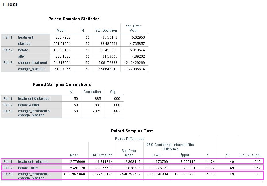
However, there is an alternate way of getting p-values for these data. Instead of running a repeated measures ANOVA you can do some addition or subtraction to get rid of one factor and then use repeated measures t-tests to compare the remaining conditions. For example, to analyse a treatment effect you add the before and after values from the treatment and the placebo condition, respectively, and compare them. Which works similarly for the time point effect. For the interaction you have to deduct the before condition from the after condition for both treatment conditions and then compare. Below is the output of this approach and it may surprise you that you get exactly the same p-values (0.246, 0.062, 0.026) as from the ANOVA. If you Bonferroni correct these none of them remain significant.
Data summed and analysed in SPSS 24 using the TTEST command (see SPSS script for details).
For me this approach was an eye-opener, as in your first stats lesson you learn that running three t-tests means you must correct for multiple comparisons. Since you get the same p-values running ANOVA, it obviously does not magically self-correct for this problem and you have to manually correct as for t-tests. I have added my simulated data and my SPSS-script so you can try this out yourself (you can also check out my MATLAB code). Once you have convinced yourself, do also check out the resources in the intro to understand why this is the case. Importantly, this problem goes away, if you preregister the interaction as your effect of interest, but then strictly you must not calculate the main effects. Please let me know, what you think about this little demonstration in the comments.
clear all
rng(20202222, 'Twister')

%here we set the amount of subjects
subs = 50;

%here we generate some random numbers as ground truth, e.g. IQ
mean_t = 100;
SD_t = 15;
truth = normrnd(mean_t,SD_t,subs,1);

%here we set the measurement error. the higher it is the lower
%retest-reliability
error_variance = 8;

%effect size (ratio of variance and mean is effect size)
effect_variance = 10;
mean_effect = 5;

%Here we generate data from our "Experiment" with 2 repeated measures
%factors, e.g. treatment vs placebo and before vs. after
data(:,1) = truth+normrnd(0,error_variance,subs,1);
data(:,2)= truth+normrnd(0,error_variance,subs,1)...
+normrnd(mean_effect,effect_variance,subs,1);
data(:,3)= truth+normrnd(0,error_variance,subs,1);
data(:,4)= truth+normrnd(0,error_variance,subs,1);

%we sum some of the data for t-tests
data(:,5)=sum(data(:,1:2),2);
data(:,6)=sum(data(:,3:4),2);
data(:,7)=sum(data(:,[1 3]),2);
data(:,8)=sum(data(:,[2 4]),2);
data(:,9)= data(:,2)-data(:,1);
data(:,10)= data(:,4)-data(:,3);
data(:,11)=sum(data(:,1:4),2);

%quick t-test to see if there is a significant difference
[h,p] = ttest(data(:,1),data(:,2));

%here you can check the correlations, you should aim for something
%realistic
reliability = corrcoef(data(:,1:4));

%create variable name header for SPSS
Header = {'before_treatment' 'after_treatment' 'before_placebo' ...
'after_placebo' 'treatment' 'placebo' 'before' 'after' ...
'change_treatment' 'change_placebo' 'all_data'}; %header
textHeader = strjoin(Header, ',');

%write header to file
filename = 'ANOVA_blog_data.csv';
fid = fopen(filename,'w');
fprintf(fid,'%s\n',textHeader)
fclose(fid)

%write data to end of file
dlmwrite(filename,data,'-append');
[/codesyntax]
SPSS syntax
PRESERVE.
SET DECIMAL DOT.

GET DATA  /TYPE=TXT
  /FILE="...\ANOVA_blog_data.csv"
  /ENCODING='UTF8'
  /DELIMITERS=","
  /QUALIFIER='"'
  /ARRANGEMENT=DELIMITED
  /FIRSTCASE=2
  /DATATYPEMIN PERCENTAGE=95.0
  /VARIABLES=
  before_treatment AUTO
  after_treatment AUTO
  before_placebo AUTO
  after_placebo AUTO
  treatment AUTO
  placebo AUTO
  before AUTO
  after AUTO
  change_treatment AUTO
  change_placebo AUTO
  @all AUTO
  /MAP.
RESTORE.
CACHE.
EXECUTE.
DATASET NAME DataSet3 WINDOW=FRONT.


GLM before_treatment after_treatment before_placebo after_placebo
  /WSFACTOR=treatment_factor 2 Polynomial timepoint_factor 2 Polynomial
  /METHOD=SSTYPE(3)
  /CRITERIA=ALPHA(.05)
  /WSDESIGN=treatment_factor timepoint_factor treatment_factor*timepoint_factor.


DATASET ACTIVATE DataSet3.
T-TEST PAIRS=treatment before change_treatment WITH placebo after change_placebo (PAIRED)
  /CRITERIA=CI(.9500)
  /MISSING=ANALYSIS.
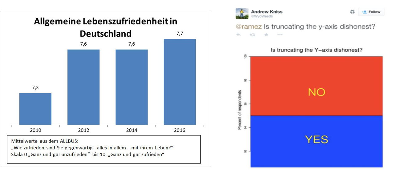
So, the other day I responded to a tweet by Felix Schönbrodt. He called out a tweet by GESIS – Leibniz-Institut für Sozialwissenschaften that showed data on life satisfaction in Germany from 2010 to 2016 without a y-axis (below left). He added a picture of a tweet (below right) that suggests it is dishonest to truncate your y-axis and I completely disagree with the message of this tweet! Importantly, I do agree with Felix that the GESIS graph was a prime example of how not to visualize data. Still, I want to use this post to point to some considerations, when choosing the range of your y-axis.
Left: graph posted by GESIS – Leibniz-Institut für Sozialwissenschaften on twitter. Right: picture of tweet posted by Felix Schönbrodt on twitter.
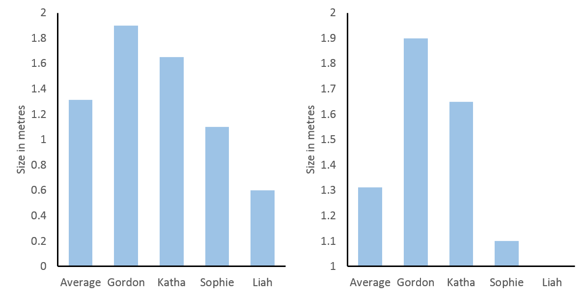
First of all let’s make the case for including “0” in bar graphs (a more detailed account can be found here) and then move on to situations where it is dishonest not to exclude it. I believe Felix’ main point is that in a bar graph the height of the graph represents something meaningful about the data. One case, where this is in-arguably true, is for height, e.g., below, I have graphed body heights of my family. In the left panel, I have included “0” and you can roughly judge that I am twice as tall as my daughter Sophie. If the y-axis is truncated, as in the middle right panel, this same interpretation would make me ten times taller than Sophie and in fact, in that graph, Liah is infinitely smaller than me. Nonsense.
Left: heights of the Feld family with y-axis starting at 0. Right: heights of the Feld family with y-axis starting at 1.
Of course, this was an over-exaggeration to make a point. However, since people have the expectation that the height of a bar graph is relevant to its interpretation, it will distort how people interpret more relevant and realistic data, if this is not true. And this expectation is only true, if the data have a meaningful “0”, which is directly connected to the scale of measure. In statistics a scale that has a true “0” is called an absolute scale and it shares the feature of our above left bar graph that ratios can be interpreted, i.e., we can say the value 4 is twice as large as 2 (just as we said I am twice as large as Sophie).
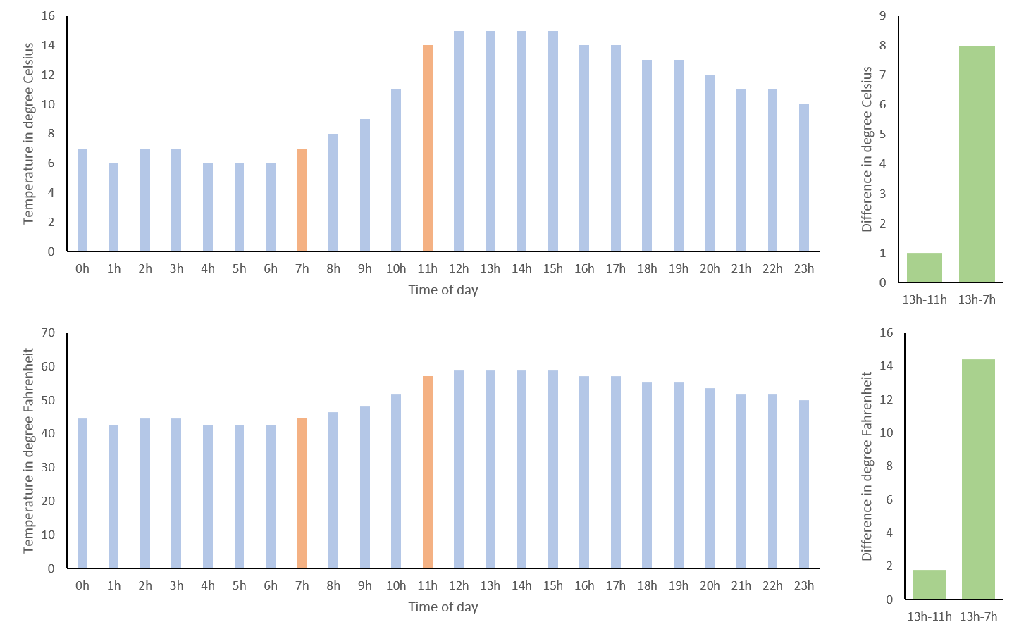
To contrast this, let’s move to some other data, the forecast for temperature in degree Celsius in St. Albans/UK on 7th April (see below top left and know that I am not very happy about this forecast). 0°C may seem like a true “0”, since it is the temperature at which water freezes. Thus, when comparing 7h and 11h (in red) you might be tempted to say that the temperature has doubled from 7°C to 14°C in four hours. However, a quick look at the same data transformed to degree Fahrenheit (below lower left) reveals this to be untrue (57.2°F at 11h is not twice as high as 44.6°F at 7h). The reason for this is that these scales are interval scales, which means that only the ratio of their differences can be compared. For example, the difference in temperature between 13h and 7h is eight times the difference in temperature between 13h and 11h, regardless of measuring in °C or °F (below right).
Temperature forecast for St. Albans on 7th April 2018. Top left: in degrees Celsius. Bottom left: in degrees Fahrenheit. Top right: difference in temperature in degree Celsius between 13h and 11h as well as 13h and 7h. Bottom right: difference in temperature in degree Fahrenheit between 13h and 11h as well as 13h and 7h.
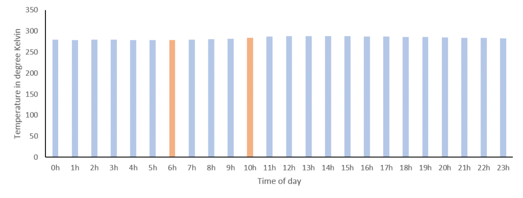
We can get around the shortcoming of interval scales in this case, as temperature can be expressed in degree Kelvin, which has a true “0” (nothing can be colder than absolute zero). However, if you look at the graph for °K (below) you see that this is not very helpful. While we could now validly interpret the ratio of temperatures, including absolute zero has scaled the graph so that the small differences of interest to me are no longer discernible. This is probably why we still hang on to our outdated use of °C or °F, as they nicely scale with the range relevant to our daily lives.
Temperature forecast for St. Albans on 7th April 2018 in degrees Kelvin.
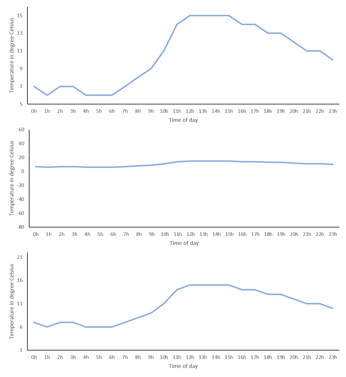
Note, if a scale does not have a true “0” or if it would make the interesting differences indiscernible, we should not use bar graphs, to convey that ratios of values cannot be interpreted. An alternative simple way to visualize data that does not imply this, is the line graph, which works nicely for time series data like our temperatures. However, excluding “0” – as it is not informative – introduces bias, since we need to decide which arbitrary range the y-axis should cover. This can make a huge visual difference! For our temperature data a simple approach could be for the y-axis to start at the minimum and end at the maximum values measured for that day (below top) or you could use the minimum and maximum temperatures measured on earth in general (below middle). However, you might agree that the first exaggerates the differences across the day and the other marginalizes them, so like me you might prefer to use the average minimum and maximum temperatures in St. Albans measured over the year (below bottom). Importantly, your choice will depend on what you want to convey and the expectations of your audience. In other words you should use a meaningful range.
Temperature forecast for St. Albans on 7th April 2018 in degrees Celsius. Top: y-axis range 5° to 16°. Middle: y-axis range -80°to 60°. Bottom: -axis range 1°to 22°.
The definition of what is meaningful sometimes seems a bit arbitrary and, if you have read How to Lie with Statistics by Darrel Huff, you may think the goal of any data visualization is to deceive instead of conveying meaning. And for sure, as we have seen, choosing the range of your y-axis you can make very small differences look huge or very large differences look irrelevant. However, it is dangerous to suggest that there are no guidelines how to visualize data and anything is up to interpretation. In the next paragraph, I will try to make the point of using the variance of the data as a meaningful tool to fix your y-axis range.
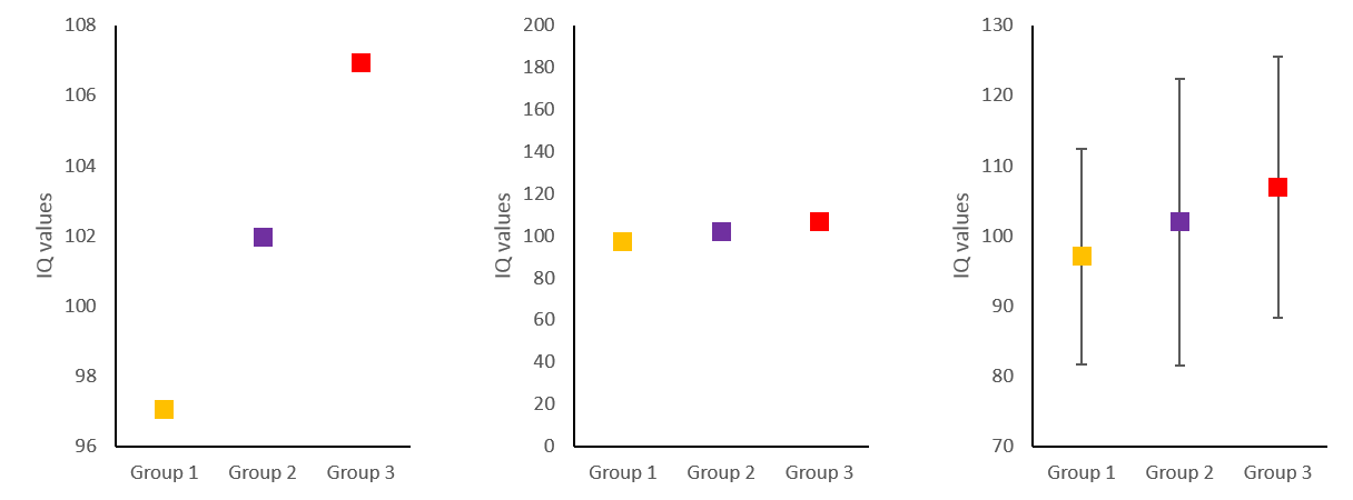
Below, I have simulated some IQ-values (mean = 100, SD = 15) in three different groups (let’s say orange-, purple- and red eyed-people) and made three graphs with different y-axis ranges. On the left, it looks like having orange eyes is related to a much lower IQ than having red eyes, whereas in the middle the differences looks negligible and this is – as we know – only because I have chosen the y-axis to make this impression. Luckily, in science, a relatively unbiased way to choose the scale of your y-axis, is to include the variance of your variable. On the right, I have added the standard deviation of each group as error bars and changed the range of the y-axis to roughly the mean plus minus twice the standard deviation. Now differences no longer need to be interpreted in relation to the y-axis range, but can be related to the variance of the variable. The gold standard, of course, is to define the range of your y-axis with respect to the variance expected from the literature, as this is not biased by the level of noise in your measurements. Importantly, if the error bars in a graph look very large or very small, this may indicate that somebody is trying to deceive and make you believe differences are smaller or larger than they really are. If it is your graph, you may be deceiving yourself.
Simulated IQ-data in three groups (mean = 100, SD = 15). Left: y-axis range 96 to 108. Middle: y-axis range 0 to 200. Bottom: y-axis range 70 to 130.
In conclusion, I believe, it is not dishonest, if your y-axis does not include “0”. However, it is very important that the range of your y-axis covers a meaningful interval, which is often defined by the sample variance of your variable or by a priori consideration of typical variance in that variable. Coming back to the GESIS graph, it is clear that its y-axis does not cover a meaningful range, as it overemphasized changes of only 0.4 on a 10 point Likert scale and does not provide error bars.
Currently, I am curating the German version of the Real Scientist twitter account and this is a lot of fun. At Real Scientist real scientists get to tweet about their work and benefit from the following of the account, which is usually larger than their own. During the week I have used twitter’s survey function to find out more about the follower’s sleep habits, me being a sleep and memory researcher and all. This was helpful to break down some of the more complicated information I wanted to relay. Here is how I tried to use twitter to also collect some memory data. Here is a link to the associated twitter thread.
After one of the sleep surveys, I got into a little bit of a discussion with one of the followers about how to analyse these data and of course the restrictions of twitter surveys don’t really allow a lot of flexibility. This prompted me to use an outside survey service for my little experiment. Essentially I wanted to use the Deese–Roediger–McDermott paradigm (Deese 1959, Roediger & McDermott 1995) to demonstrate to the followers how easy it is to induce false memories.
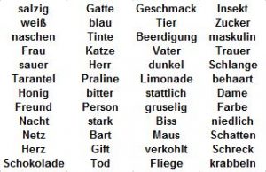
List of German words that can be grouped by the category words “süß”, “Mann”, “Spinne” and “schwarz”. Note that the category words were not used in the lists and participants were not told that there were categories.
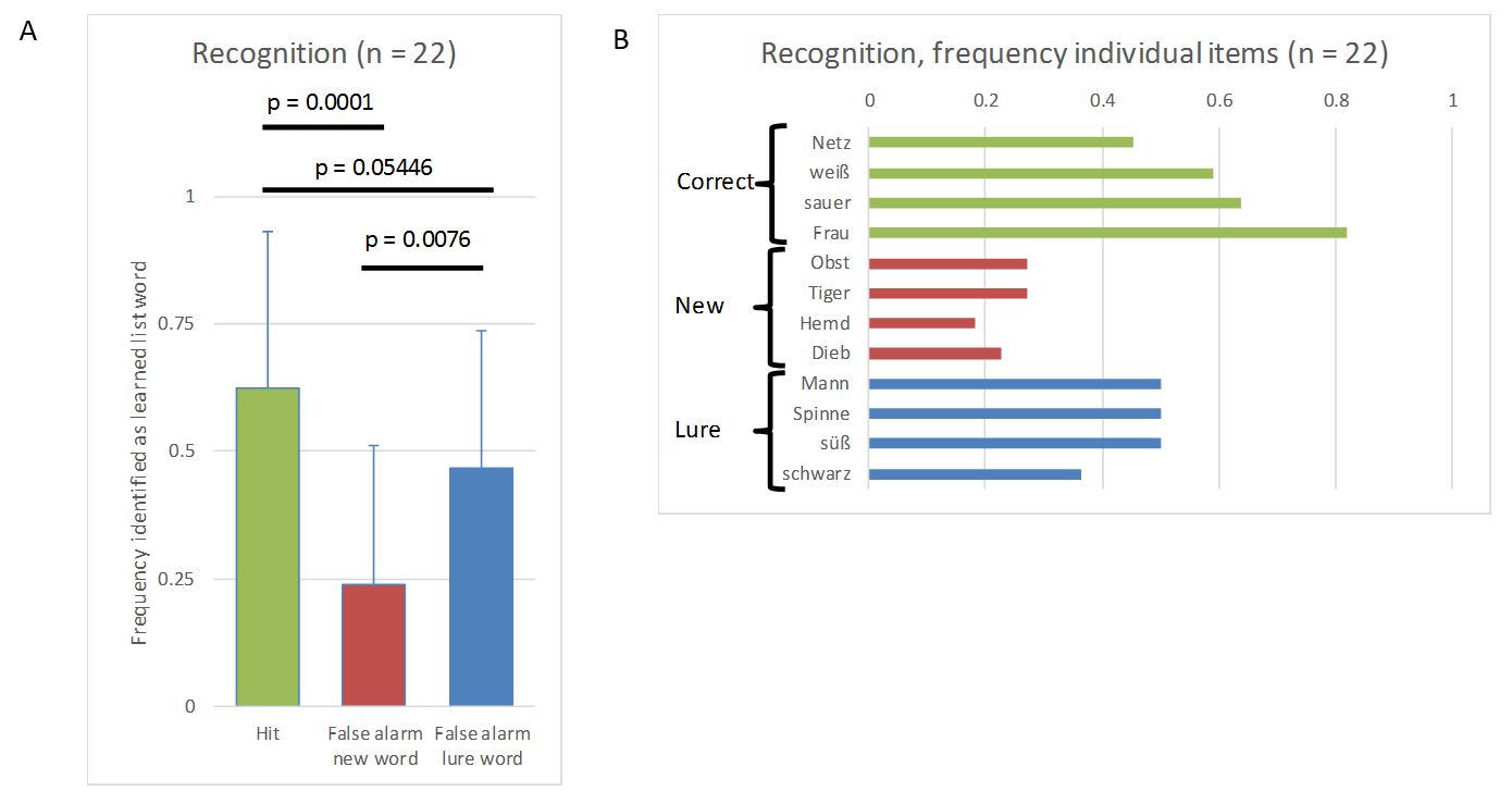
To this end I showed a list of German (this was German Real Scientist after all) words that pertained to four categories and were randomly mixed. I asked the twitter followers to memorize the words and told them I would delete the tweet in the evening. The next day, I provided a survey using a third party service, which contained old words (from the list), new words and lure words. It asked participants for each word, if it was part of the originally learned list. New words were not related to the learned list in any meaningful way, but lure words were associated to the four categories of the original list. In the end, 22 followers (of 3000) actually filled in the survey.
Luckily for me, the data showed exactly what could be expected from the literature (I used simple two-sided paired t-tests for the p-values). 1. Trivially, hits (correctly identifying an old word as being part of the learned list) were more frequent than false alarms for new words (incorrectly identifying a new word as being part of the learned list). 2. Importantly, false alarms for lures (incorrectly identifying a lure as being part of the learned list) were more frequent than false alarms for new words. 3. Reassuringly, hits were still more frequent than false alarms for lures. These data nicely demonstrated that our brain’s memory system does not work like a hard drive and retrieval is a reconstructive process prone to error.
Data from the experiment. A) Relative frequency (mean and standard deviation) of hits and false alarms for new words and lures. B) Absolute frequency for each item being identified as an item from the learning list by the 22 participants.
All in all, I must say that I am quite happy that this little demonstration worked out and it nicely showed that you can collect more complex data via twitter. However, I was a bit shocked that I only got 22 respondents to the survey. When running a survey internally on twitter, I received about 200-300 respondents using this account. The third party service was optimized for mobile devices, so I don’t think that was an issue. It would have been so cool to run such an experiment on a couple of hundreds of people just by posting it on twitter. However, it seems leaving twitter is a much higher hurdle than I had anticipated.
In my first ever blogpost I speculated whether uploading your brain would result in potentially eternal life. And I concluded it was possible. However, I also concluded that what we experience as our self is not as continuous as we believe. I kind of glossed over the reasons I believe that to be true. Since elaborating this allows me to talk about two of my favourite thought experiments, I decided to write this short add-on.
The malicious demon thought experiment by Descartes supposes there is a being that can produce a complete illusion of the external world:
I shall think that the sky, the air, the earth, colours, shapes, sounds and all external things are merely the delusions of dreams which he has devised to ensnare my judgement. I shall consider myself as not having hands or eyes, or flesh, or blood or senses, but as falsely believing that I have all these things.
This idea of course has been used many times. It is the plot of the movie Matrix and is also used for the simulated reality or the brain in a vat arguments. It is perfect to demonstrate that we are unable to tell apart reality and illusion, if the illusion is good enough.
The “five minute hypothesis” by Bertrand Russel works in a similar way, but goes even further. It assumes that everything in the universe, including human memory, sprung into existence five minutes ago. In this scenario an event that you remember does not necessarily have to have happened, as long as the molecular structures of the memory were put in place also five minutes ago and, thereby, create the illusion that it happened. It is impossible to prove that this hypothesis is wrong. Of course, it is also not possible to prove that it is correct and entertaining it as a real possibility is mostly meaningless. Rather, you may use it to scrutinize your feeling of continuity of self. To this end, if neuroscience were able to prove that a continuity of the self exists outside of plastic brain changes (i.e., the molecular structures of the memory), it would disprove this hypothesis.
So far I am unaware of such data and I believe it is highly unlikely they will ever exist.
The idea of living forever in a digitalised form has become popular and recently even featured in the Dr. Who Christmas Special 2017. [SPOILER] An advanced civilisation kidnaps individuals at the very last second of their lives, extracts all their memories and returns them for their deaths. It is revealed that this enables the individual to come back to life using an avatar resembling their body shortly before death. [/SPOILER]
In a way this idea is not very new, as it entails the classical problem of identity. The most ancient thought experiment in this domain is the Ship of Theseus or the Theseus paradox. The Grandfather’s Axe is a modern version of this conundrum: imagine an axe is passed down in the family over generations and over time both head and handle are replaced. Is it still the same axe? (Of course the axe would claim to be the same axe, if you asked it, but that’s whole other story.)
In a similar way, you can ask what would be the consequence of replacing one single biological neuron in a human’s brain with one single artificial neuron that mimics all of the original neuron’s connections and functions. Would this make the respective human a different individual? Over time, you could exchange one neuron, then another, and another until the whole brain is made up of artificial neurons. At what point is the person no longer the original? Most people would agree that this gradual change, if it takes place over a period of say years, would mean the person stays the same individual, whereas, making an artificial copy of the original brain (which is in all important ways equivalent to uploading it to a machine) would mean the new individual is not the same as the original. (This is essentially a rephrasing of the teleportation paradox.)
This paradoxical differentiation is due to a strong subjective feeling of continuity that is violated by the idea of uploading or copying people’s brains. For example you feel this continuity, when you wake up after a night of sleep and are convinced that you are the same person as when you went to bed (I stole this great example from Guilio Tononi’s Phi). As far as we know, this feeling is merely a product of sampling the memories of being yourself and realizing you have not changed. Put more drastically, the only thing that keeps your experience of self continuous, is the constant plastic changes that are occurring in the brain and producing congruent memories that can be sampled. Unless one argues that there exists something like a non-material soul, all these memories can potentially be part of a brain-upload.
In conclusion, there is no difference between the experience of uploading your brain to a computer and experiencing the flow of time in your dedicated biological body. Not because you remain yourself when you are uploaded, but because there is no continuous self. In this sense continuity of self is an illusion and an upload of all your memory would in essence enable eternal life. However, this absence of actual continuity of existence also means that your life only lasts a moment. In the each new moment a fleeting individual is born that inherits all you memories and only lasts a moment before it again is replaced.
If this sounds a bit depressing, you can console yourself with this: When you are out partying and have that one drink too many, it’s not you who suffers that hang-over but future-you. And who cares about her?
So finally I have gotten around to activating this site. It has been sitting around now for about two months and as the dust settles I just wanted to send out a quick hello in case anybody is listening. This page is intended for my personal musings and I hope I can regularly post things about neuroscience, philosophy and current developments. Of course, this page is merely a sly trick to advance my career, so don’t expect any actual original content. That’s it for now, watch out for my first actual post though…
Have you submitted a poster or symposium talk to #PuG2022 and use/discuss #OpenScience practices? Apply for this prize! ⬇️🔥 https://twitter.com/igor_dgps/status/1519915051930558466
This website uses cookies to improve your experience. We'll assume you're ok with this, but you can opt-out if you wish.AcceptRead More
Privacy & Cookies Policy
Privacy Overview
This website uses cookies to improve your experience while you navigate through the website. Out of these, the cookies that are categorized as necessary are stored on your browser as they are essential for the working of basic functionalities of the website. We also use third-party cookies that help us analyze and understand how you use this website. These cookies will be stored in your browser only with your consent. You also have the option to opt-out of these cookies. But opting out of some of these cookies may affect your browsing experience.
Necessary cookies are absolutely essential for the website to function properly. This category only includes cookies that ensures basic functionalities and security features of the website. These cookies do not store any personal information.
Any cookies that may not be particularly necessary for the website to function and is used specifically to collect user personal data via analytics, ads, other embedded contents are termed as non-necessary cookies. It is mandatory to procure user consent prior to running these cookies on your website.